Nubank

Making a New Bank Feel Familiar

Senior Product Designer, Growth

Senior Product Designer, Growth

Fintech, B2C

Shipped 2020

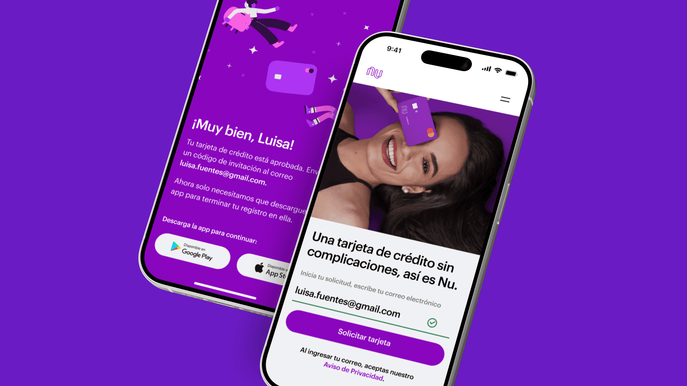
Nu Mexico digital banking web to mobile signup interface

The Backstory

Meet Natalia.

Natalia was curious about Nubank.

She liked the idea of a bank she could use entirely from her phone, without branches, paperwork, or waiting. But there was still a question in the back of her mind: Can I really trust a bank I've never walked into?

For Natalia, applying wasn't just a matter of filling out a form. She was sharing personal information, making financial decisions, and entering a relationship with a company that was completely new to her. And she wasn't alone.

Nubank was entering Mexico with a product experience that had already proven successful in another market. But Mexico brought different expectations, behaviors, and regulatory requirements.

We had to make a new kind of banking experience feel familiar, without hiding the complexity behind it.
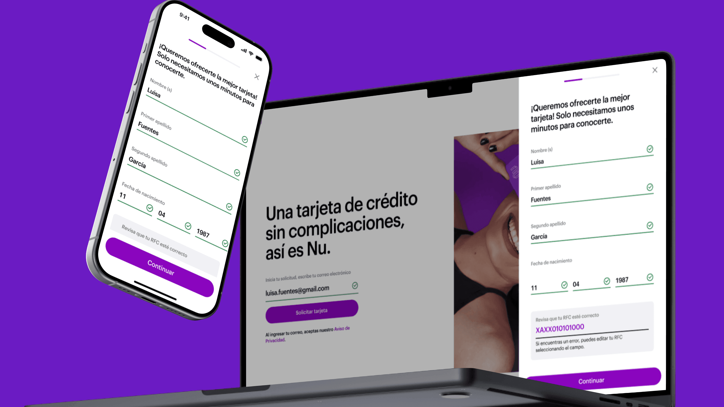
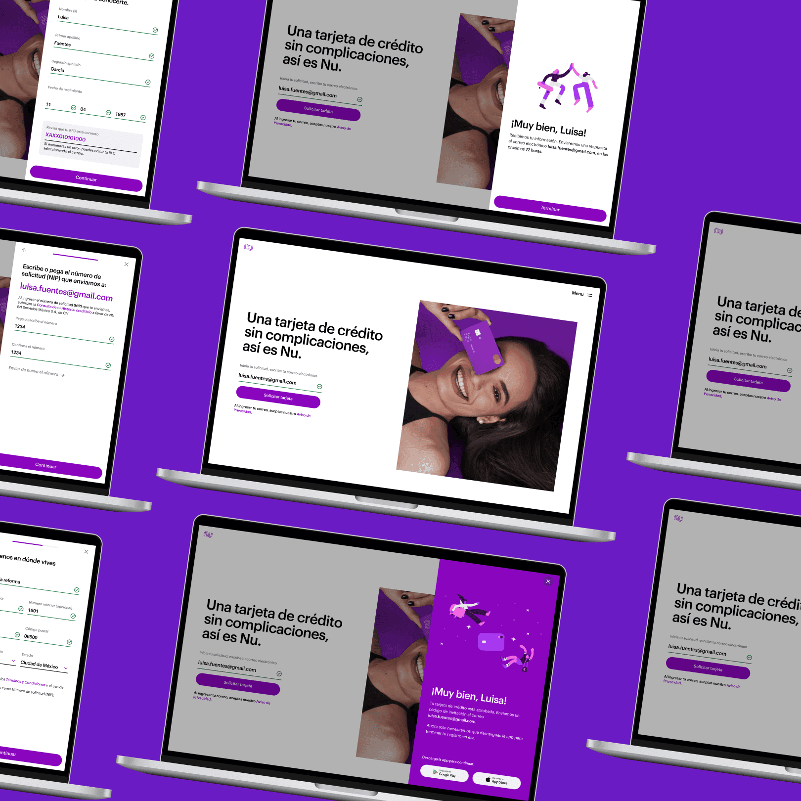
Nu Mexico conversion flow design showing trust and transparency elements

What We Built

01.

Make the unfamiliar feel familiar

Natalia's hesitation wasn't unique. Research helped us understand where trust broke down, from security and transparency to the information people needed before taking the next step.

We shaped the acquisition experience around reassurance rather than explanation.

02.

Turn minutes into seconds

Every unnecessary step created another opportunity for hesitation.

We simplified the acquisition funnel, reducing friction while keeping each step clear and easy to complete.

03.

Design around the rules, not against them

Launching in Mexico meant working within regulatory requirements that couldn't simply be designed away.

We integrated those constraints into the experience without breaking the user's momentum.

04.

Make trust visible

A digital bank doesn't have a branch, a desk, or a person sitting across from you.

The interface had to do some of that work, making each step feel transparent, predictable, and trustworthy.

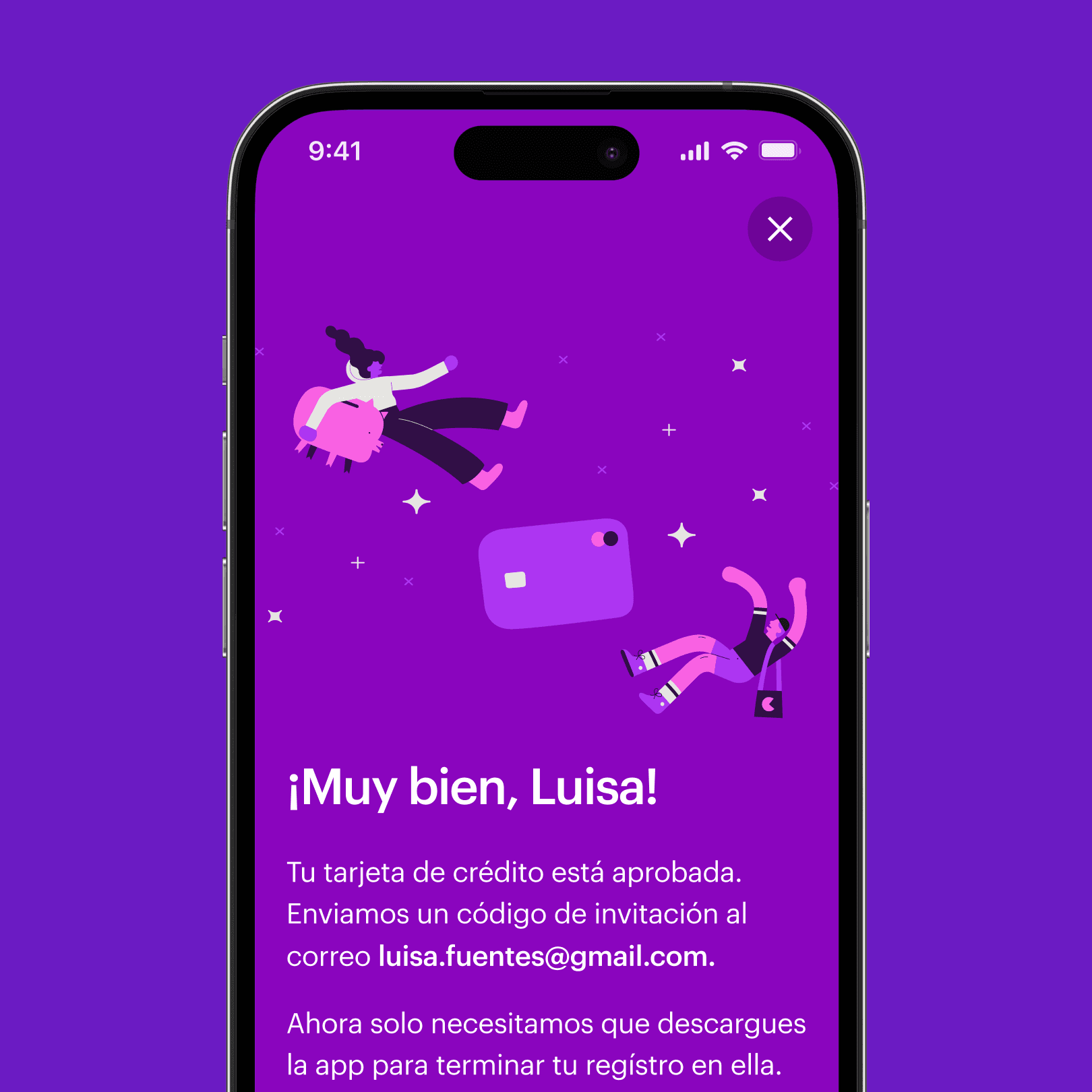
Nu Mexico credit card approval screen in Spanish
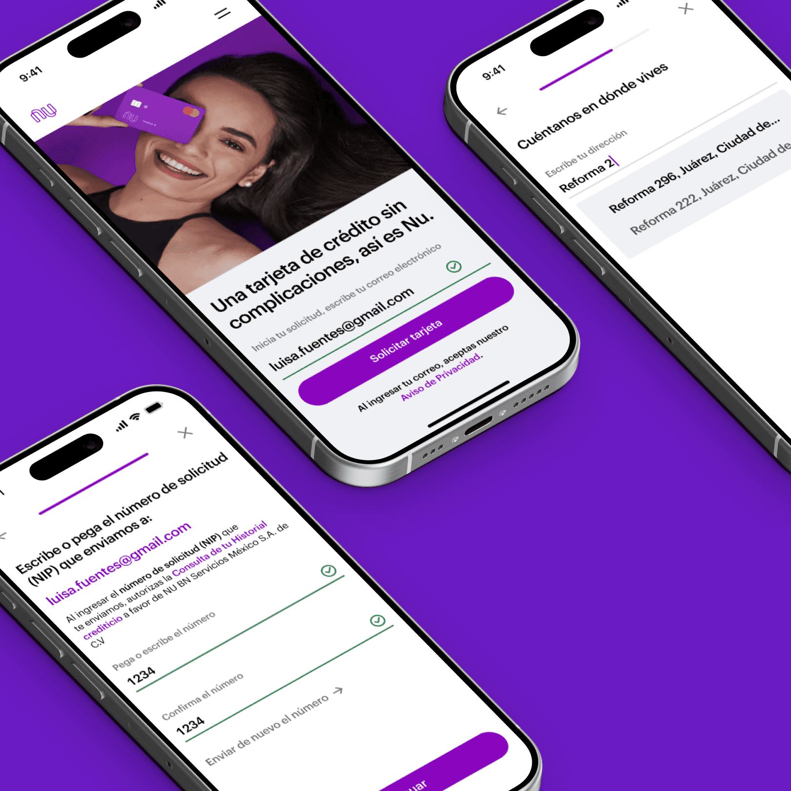
Nu Mexico email registration and card request screen
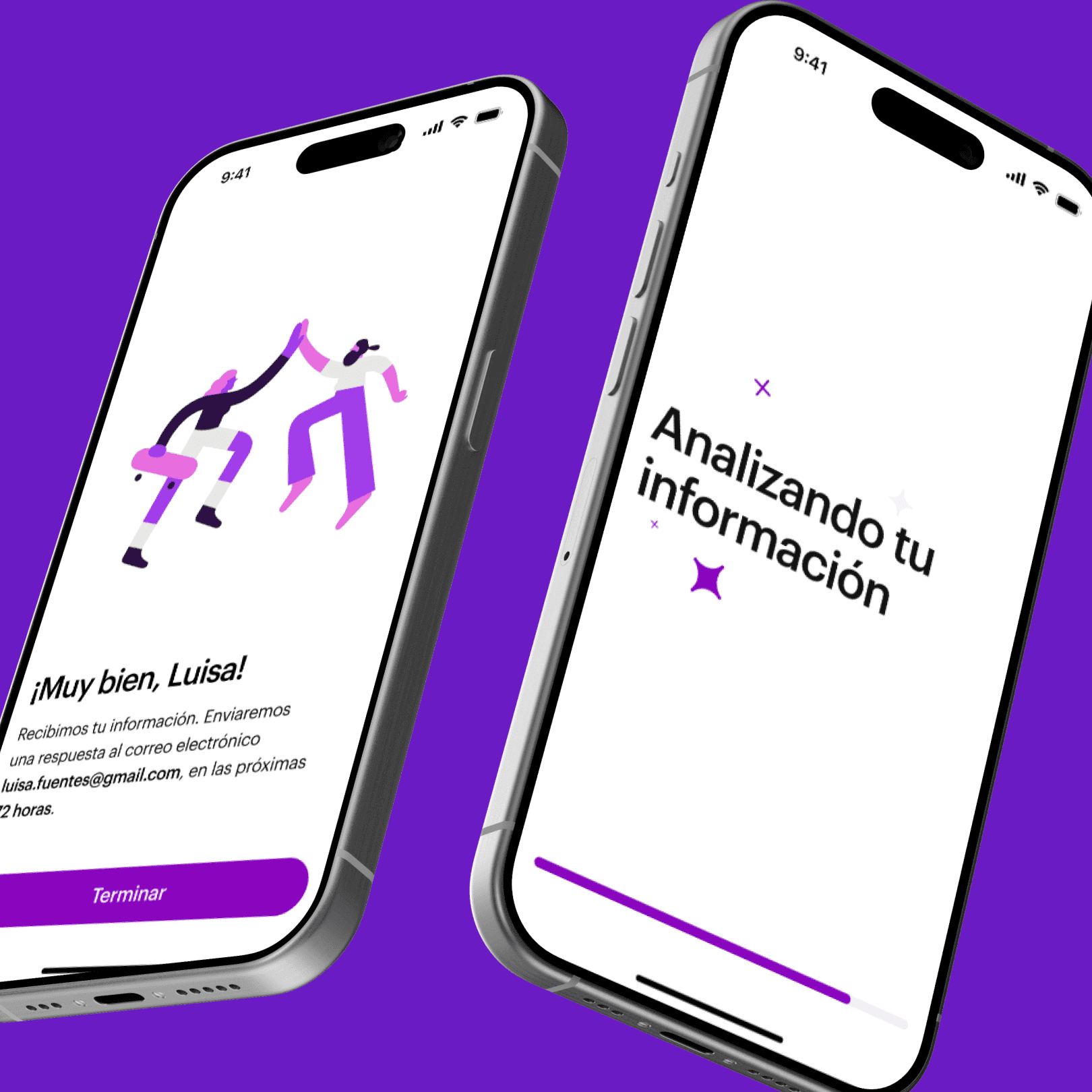
Nu Mexico mobile app card verification flow
Nu Mexico onboarding screen with privacy policy confirmation
Nu Mexico credit card approval screen in Spanish
Nu Mexico mobile app card verification flow
Nu Mexico email registration and card request screen
Nu Mexico onboarding screen with privacy policy confirmation

The Outcome

01.

120K customers acquired

Nubank acquired 120K customers in its first year in Mexico, exceeding the original 75K target by 60%.

02.

1.5× higher conversion

The redesigned acquisition experience improved conversion by 1.5×.

03.

A faster application

The streamlined journey reduced friction and brought average signup time below five minutes.

04.

Built for Mexico

The experience balanced Nubank's established product principles with Mexican customer expectations and regulatory requirements.

And Natalia?

Natalia didn't need to understand how Nubank worked behind the scenes. She needed to understand what would happen next.

Designing Nubank's first experience for Mexico reminded me that trust isn't something you add to a product at the end. It's built into every decision: what you explain, what you remove, and when you ask someone to take the next step.

For me, that's the interesting part of product design. Making something unfamiliar feel simple enough to trust.